5 Must-Have Features for Your E-Commerce Website

Newly Launched Blue Iris Marketing Client WordPress Websites
August 28, 2020

Online businesses are thriving, and rightly so. According to the U.S. Department of Commerce, Americans spent $791.7 billion on e-commerce in 2020, up 32.4 percent from 2019. This increase was caused in part by the coronavirus epidemic and statewide lockdowns, which forced shoppers to rely on internet shops for their consumption needs.

If you’re looking to create your first e-commerce website or if your current site isn’t generating enough traffic or money, you might be wondering what it takes to have a successful e-commerce website.

Here are the five most critical elements that every e-commerce website should have:

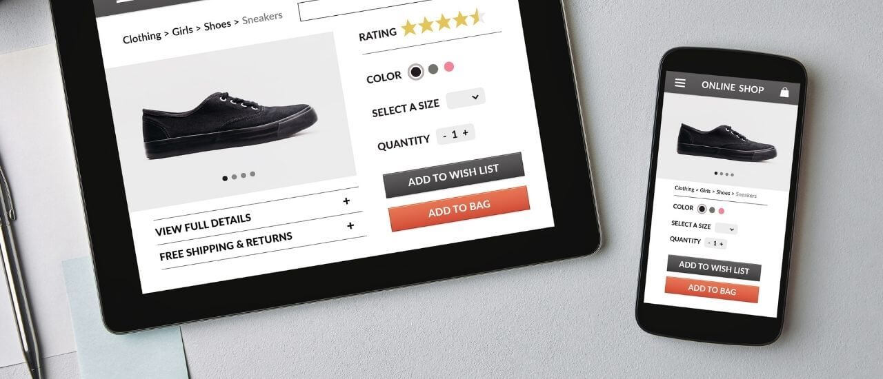
1. Mobile-friendly, responsive design

People are surfing the internet on their mobile phones in greater numbers than ever before. According to Statista.com, 53.9% of U.S. retail e-commerce sales come from mobile devices. With more than half of all internet traffic now coming from mobile devices, it is vital that your website is optimized for mobile viewing.

A mobile-friendly website is built and optimized such that every visitor, regardless of mobile device, can use all of the website’s capabilities. This includes the following website functions:

  • Loads quickly – this is especially crucial for visitors who use a mobile network and mobile devices
  • Easy to read – mobile phone screens are one-fifth the size of desktop computer screens
  • Easy to navigate – menus on mobile devices have limited space, therefore they must be easy to traverse with a finger
  • Avoids utilizing Flash – Flash-based content is not mobile-friendly; if you want to employ animations, consider using other technologies such as HTML

2. High-quality images and videos

Including top-notch images and videos on your website helps you promote your products and services professionally and improves the website’s usability.

Additionally, the average consumer’s attention span is shortening, necessitating new marketing strategies. What appears to be a growing Internet trend? Product videos. According to Hubspot, 73% of visitors who watch product videos will buy, and 71% of buyers choose video over other marketing content, making video one of the most crucial selling elements on an e-commerce website.

To assist your audience in visualizing the goods, try taking high-quality images and videos from various angles. If you can’t hire a professional, don’t worry — Hubspot has an article on how to take high-quality product shots using your smartphone. Personally, I love the iPhone’s portrait mode for product photography and even professional headshots. Have fun and get creative!

Keep in mind that big graphic sizes can create slow-loading pages. According to survey results, more than half of website visitors anticipate a page to load in under two seconds. This issue can be avoided by using image and page performance optimization strategies. If you have a WordPress website, learn more on how to speed up your site.

3. User-friendly navigation, search, and product filtering

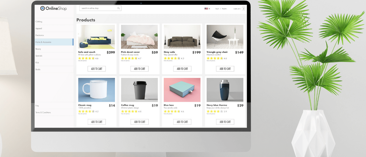
If customers can’t find what they’re looking for quickly, it’s game over. The primary goal of an e-commerce website’s navigation is simplicity. Customers will spend more time on your website if it has a variety of menu options, extensive search features, and product filtering.

  1. Navigation – Menus that are simple to use and allow customers to browse product categories are critical components of any e-commerce UX design.
  2. Search – Make use of search functionality to allow customers to search for and filter products based on a variety of parameters (if applicable). Try adding a search box to the header and footer of your website.
  3. Product Filtering – Add product filters to make it easier for customers to find what they’re looking for. Some of the most popular filtering options are as follows:
    • Product type (eg. women, men, shirts, pants, shoes, accessories)
    • Price range
    • Color
    • Size
    • Brands
    • Ratings

The golden rule of good navigation is that your consumers should not spend too much time thinking about how to get to their destination. By making their lives a little easier, you will be rewarded in the long run.

4. FAQ section

Creating a FAQ page saves time for both the consumer and your company because basic questions can be answered by just browsing the FAQ page. Orders, shipping, and return policies, as well as contact information, should all be included on the FAQ page.

Furthermore, offering answers to frequently asked questions on your website helps to boost your website’s reputation among site visitors. A consumer is more inclined to purchase goods if he or she trusts the company. Make the most of any opportunity to assert your authority.

Finally, for easy accessibility, include a link to your FAQ page in the footer or main menu.

5. Enticing product descriptions

The best product descriptions address your target audience directly. What are their interests, are they more outgoing or reserved, and how do they communicate? Make use of this information when writing your product description.

Furthermore, vivid descriptions enable customers to imagine and envisage themselves using the goods in their daily lives. Consumers’ imagination about owning something has a big impact on their purchasing decision. For more insights, read this post by Wix on how to write a product description that sells. Go ahead, let your creative juices flow!

Looking to build an e-commerce website? Here’s a quick checklist to get you started:

  1. Secure your domain name.
  2. Determine the best e-commerce platform for your needs. WooCommerce for WordPress and Shopify are two popular platforms.
  3. Decide on hosting. Some platforms offer their own hosting with a wide range of pricing and features. For WordPress, we recommend Siteground. Shopify has its own hosting.
  4. Set up your credit card processing system. Accepting credit card payments is often done through your own merchant account or through a payment gateway account such as PayPal, Stripe, Clover, and so on.
  5. Create a list of all your products, complete with descriptions and product filtering categories.
  6. Take high-quality photographs and videos of your merchandise.
  7. Select a website theme or have a professional create one for you. Most e-commerce platforms like WordPress have a variety of website themes to choose from.
  8. Determine overall website navigation, structure, design, and UX experience.
  9. Build & design the e-commerce website.

Need help with building or updating your e-commerce store? We’re here to help!

Jillian Vanarsdall
Jillian Vanarsdall
Founder of Blue Iris Marketing. An inbound marketing agency assisting businesses, from start-ups to high-growth firms, to phenomenally tell their unique story in a noisy digital world. Our services include inbound marketing, Wordpress web design and development, SEO, and social media.

Leave a Reply

Your email address will not be published. Required fields are marked *

7 − 4 =