What is a Landing Page

The Buyer’s Journey: What is the Awareness Phase
October 25, 2016
Increase Organic Clickthrough Rates
November 3, 2016How to Increase Traffic to Your Site in 1 Day
What is a Landing Page?
Think of a landing page as something sticky, like flypaper, designed to capture customer data (through a contact form) with the aid of an enticement (an offer). A good landing page is relatively simple and free of clutter so that the customer is led from the offer to the form with no distractions.
The sole purpose of the page is to obtain information from the customer. With this in mind, webpages featuring a form together with content that isn’t there to aid information capture are not considered landing pages in the strictest marketing sense.
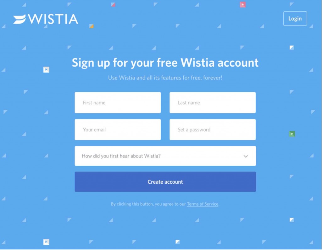
So in a nutshell, think form + minimum (action oriented) text and few if any links (to avoid leading the prospect away from the page). Here is a great example of a high-performing landing page.
What is an offer?
An offer is what the prospect visiting your site will receive in return for sending you their data through the lead form on your landing page. The offer should help move the prospect toward the next stage of the buyer’s journey. It should provide answers to questions the prospect has about their symptoms, problem or solution.
What kind of offer should be on the Landing Page?
So what should you offer? A powerful offer is one that meets the need of the prospect, and for which the landing page is specifically developed. It should be something that pushes the prospect nearer the close. To determine what your offer should be you will first need to build your Buyer Persona.
What’s that I hear you cry? Think of it as a document mapping out the buyer’s psychology in relation to their goals and behavior. You’ll need to develop a buyer persona document for each unique type of buyer you serve. We’ve written a comprehensive series – “How-to” develop a detailed buyer persona and provided our own detailed agency template for you to use.
Choose the best offer for your Buyer Persona
So what’s going to be the best offer to use here? You want to come up with something that will be irresistible to your prospect. It’s worth spelling out I-R-R-E-S-I-S-T-I-B-L-E. Not ‘good’, not ‘ok’, not ‘meh’ (yikes!). If you want to put things in perspective for a moment, think how huge the web is, how many offers are out there. If they’ve reached your landing page, then BAM! you want to convert them and not have them turn on their heels and scoot off to Google.
Choose the best format for your offer for each phase of the Buyer’s Journey
What format do you use for your offer? Always keep in mind when choosing a format that it must compel the visitor to really WANT your offer. There’s the traditional coupon or discount, but they might be more interested in some kind of free trial offer or information through the form of a white paper, video or webinar. To work out what they – hang on, scrub that – let’s be more specific and give ‘they’ (your buyer persona) a specific name. This will help you focus on who exactly your buyer is and drill down to what they want. Let’s call him Jeff, but you could just as easily call him Amanda, Fluffy or Albatross.
Now Jeff has a problem, a need, and you’re going to be his Mr. Fixit with an offer that will solve his problem. So you need to work out who Jeff is, how he thinks, what he needs, and then you can decide what you’re going to offer him.
What about Landing Page content?
Remember that your landing page needs to be simple and uncluttered. It’s important to strike the right balance of “white space.” Once the prospect arrives on the landing page, you want them to begin completing the form as quickly as possible.
Your content needs to be remarkable and INSPIRING. Dull, generic or spun content will turn off the prospect (and more than likely harm your search ranking). Also, it’s a good idea to not have your navigation menu on this page. You don’t want Jeff to be tempted to click another page. Removing tempting page links will act as a subtle reminder to Jeff that the landing page is where he’s meant to be and shouldn’t be going elsewhere.
Keyword Research
Because you should be minimizing the amount of text on the page you are going to want to be pretty tight on your keywords. In your Buyers Persona for Jeff you’ll have mapped out his interests and any insights into his psyche. Use these to start to create keywords.
The best keywords and phrases for your buyer persona are, pretty obviously, the ones that Jeff uses himself. So what are these going to be and how are you going to identify them? One useful tool to engage at this stage is the Google AdWords Keyword Planner. You can also grab keywords from forums and message boards frequented by Jeff. Also check your website’s analytics to find the keywords Jeff is using to reach your site. Once you’ve compiled your keyword list, try searching for variations, even misspellings.
Now, you’ll want to analyze your list and filter out any keywords that return a low number of monthly searches (fewer than say 10).
Get inside their head
If you’ve really done your homework and gotten inside Jeff’s head to identify his thoughts, fears, challenges and goals, you’ve created a great platform for working out the keywords he uses.
Your download offer should meet a need Jeff has right now. Remember you’re his Mr. Fixit and he’s landed on your page hoping to find a solution. The download should at least partly address his solution or move him closer to it. The value of the download to you is that it should nurture Jeff further down the conversion funnel.
The download offer should:
- Benefit the prospect
- Move the prospect towards conversion
What is a form?
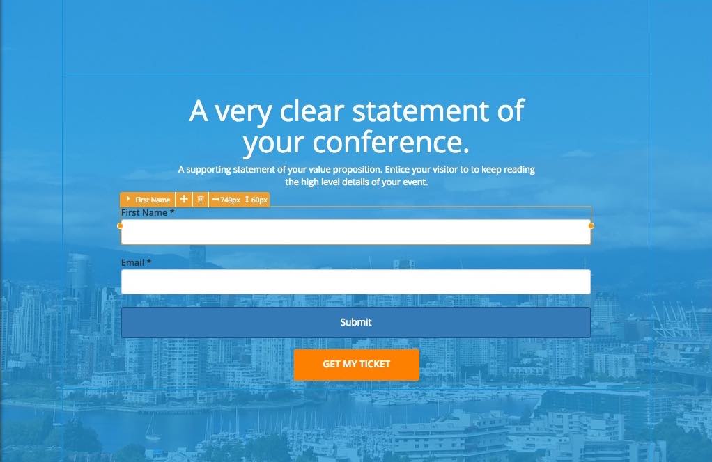
The form should be the central component of your landing page and it should appear above the fold so that visitors do not need to scroll down to reach it. A form is a vital attribute of your site – especially your landing pages. Its function is to collect data, allowing you to start learning more about your visitors.
Think of the form as a tool to capture information from a prospect. Most specifically, you’ll use this information to continually nurture your prospects through the buyer’s journey, with the ultimate goal of converting them to a customer.
What information should I request?
The fewer fields your form has, the better. You want Jeff to fill out that form as quickly as possible and click the submit button. You don’t want him to have to stop, think or go ring Mrs. Jeff to find out his shoe size. Shorter forms will bring in more leads; longer forms will bring fewer leads, but may be higher quality due to collecting more essential data.
You’ll need to identify the balance between asking for “must-have” information and “nice-to-have” information. A good guideline is to only ask for what you absolutely need. Typically, the more value your offer has, the more information Jeff is willing to exchange for it.
Your form will contain whatever information fields you deem necessary, such as Name and/or Email. As you get to the end of the consideration phase and into the decision phase of the buyer’s journey, you may want to include questions that will help you determine how serious a lead Jeff is.
What processes and systems are required for success?
At this stage, once Jeff clicked Submit, the CRM (customer relationship management) software solution you’ve implemented will come into play. So what’s that? Well, it’ll include an auto-responder email system for email marketing purposes, which in this case, means it’ll nicely automate the process of storing Jeff’s data. It will send him to a page with a thank-you message, deliver the offer to him and then send him an automated e-mail response and any other processes you deem necessary at this stage.
Popular solutions on the market include MailChimp, Aweber, HubSpot, and Constant Contact.
Call to Action!
Your landing page will also include a Call to Action to entice Jeff to move further along the conversion funnel, which in this case is submitting the form. On this point, please for the love of god avoid naming the button Submit. It’s a very dull, generic, overused term seen on most outdated ‘contact us’ forms. Forms with submit-named buttons have been shown to have much lower conversion rates.
You need to put your grey matter to work and come up with simple, engaging CTA button text that will compel Jeff to click and send off the form. Experiment with different wordings and button positions until you find the right combination that brings in the most data.
After Jeff has sent off his data through the form he should receive a confirmation email automatically and be diverted to a thank you page.
How to promote your offer
You should promote your offer through blog posts, which you ought to publish at a rate of 3 to 5 per week. One reason for such frequency is that Google favors frequent updates. Google’s algorithms allow them to crawl and index the web for fresh content – constantly, in real time.
Nearly 100% of buyers do their research online prior to making a purchase. That research is in the form of content. If you want your buyer to find your product, your site, your brand, you have to compete with the world and all its options.
If you want your pages to achieve page one ranking in the search engines, you’ve got to write excellent copy that talks to each and every buyer persona you serve. You have to speak to each buyer at each phase of the buyer’s journey. Yes! That’s a lot of content.
There’s almost no way to do it if you aren’t blogging 3 – 5 times per week. If you are just starting, then make it a goal to get at least one article per week published. Go up from there.
Your articles should be in the 1200 to 2100 word range. It’s also important to stress quality here – don’t simply churn out content for content’s sake. If it’s not going to be high quality and compelling, no need to produce and publish it. Once you’ve gotten the quality aspect right, then it is time to work on your search engine optimization (SEO). Please, avoid spinning drab text that overuses keywords and simply screams “Look at me Google, I’ve SEO’d the hell out of this,” without having anything meaningful to say.
After conversion you want to get Jeff to promote your content by sharing it on social media. Using share buttons to make it easy for your readers to share your content on social media platforms is an absolute must. But also you’ll want a strong marketing campaign featuring social media ads, Google ads, guest blogs – both on your own blog and others – and posts on forums frequented by Jeff.
Creating landing pages that speak directly to your targeted buyer personas in each stage of their journey is a lot of work. The way buyers shop today require that we provide the information they need when they need it. Your offer should speak to a very specific buyer persona and to the needs and questions they have in each of the buyer’s journey phases (Awareness, Consideration or Decision Phase). You’ll want to create offers that speak to all of their questions and needs at every stage. The most important thing you can do is get started.
If you want to kick up the speed on driving traffic to your site and totally drive up your leads and conversions, you’ll want to turn your website into a conversion-centered, customer-closing machine. We’ve written a detailed ebook about how to create a conversion-focused website and conversion-driven campaigns.
Want to transform your online results? We are experts at creating conversion-driven websites and campaigns. We can help you get started or simply answer your questions.
Message me on Facebook, Twitter, Email, or even the old fashion way – give me a call.
I’d love to talk with you.

